


Description
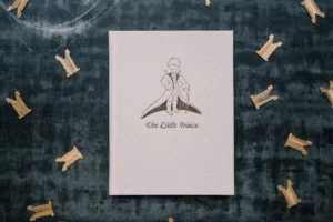
LIMITED LETTERPRESS VERSION of “The Little Prince” by Antoine de Saint-Exupéry.
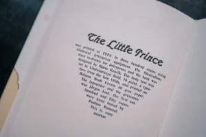
Printed in 300 copies at TYPA.
★ ★ ★ ★ ★ ★ ★ ★
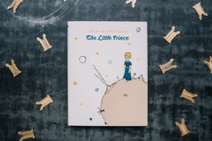
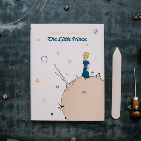
The Little Prince is one of those few stories that is widely read and cherished by children and adults alike. First published in 1943 and illustrated by Antoine de Saint-Exupéry himself, this simple tale tells the story of a child, the little prince, who travels the universe gaining wisdom. The story also addresses themes of loneliness, friendship, love, and loss. The novella has been translated into hundreds of languages and has sold over 200 million copies worldwide, making it the world’s most translated non-religious book.
In 2019, we decided to print and publish a truly special letterpress version of the beloved story of ‘The Little Prince’. Using the techniques and equipment from the 20th century or earlier, we composed the text lines on a Linotype line casting machine and printed the book on a cylinder press from 20th century. The books were printed in 300 copies, of which 150 books (‘Collector’s Edition’) were also hand-bound at TYPA.
Find the Collector’s Edition of the book here: https://www.etsy.com/listing/934077524/the-little-prince-collectors-edition?ref=shop_home_active_1&frs=1
★ ★ ★ ★ ★ ★ ★ ★
‘The Little Prince’ letterpress edition:
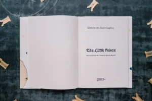
★ Title: The Little Prince by Antoine de Saint-Exupéry
★ English translation copyright © 2000 by Richard Howard. (Translation published by special arrangement with Houghton Mifflin Harcourt Publishing Company.)
★ Limited letterpress edition printed at TYPA in 300 copies.
★ Text lines casted on N-14 line casting machine.
★ Printed on Victoria Polygraph V1040-2 cylinder press. Endpapers printed on Heidelberg T.
★ Letterpress edition bound by Greif Ltd print house.
★ Book design and layout: Mana Kaasik
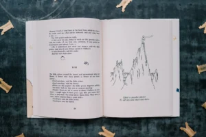
★ Illustrations: Liisi Reitalu, Mana Kaasik and Maria Kanatova based on Antoine de Saint-Exupéry’s originals
★ Fonts: Literaturnaya bold 10 p, Admiral regular 24 p
★ Content: Holmen Book 75, 80 gsm paper (letterpress printed, one color)
★ Endpapers: Munken Pure 150 gsm paper (letterpress printed, one color)
★ Dust jacket: Munken Pure 150 gsm paper (letterpress printed, four colors)
★ Covers: full-cloth, natural linen (hot foil embossing)
★ Book measurements: 155 x 206 mm (6.1” x 8.1”)
★ ★ ★ ★ ★ ★ ★ ★
★ LINOTYPE, COMPOSING & PRINTING ★
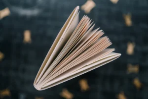
We composed the text line by line on a typecasting machine called N-14 (a soviet copy of the Linotype machine). Linotypes were widely used until mid 20th century, when offset printing took over. Once the workhorse of all printing houses, the Linotype is like a giant typewriter, that operates to a constant clicking of little brass matrices, each a mold for a single letter. One by one the matrices are assembled by key presses, formed into a line, cast into lead and then re-sorted back into their places. For the Little Prince we had to use a few hundred kilograms of metal to cast several thousand lines of text.
Once that all the text lines were casted (and proofed and recasted), we assembled the text lines and illustration plates into pages in precise layout. The assembled pages (the printing forme) was fed into a cylinder press, where a central steel cylinder rolls over the letters, creating an impression on the paper. We used our heaviest and loudest machine, Victoria Polygraph V 1040-2, to print the pages of the book.
Finally, the endpapers were also letterpress printed. To create the starry pattern, we reused the clichés with small stars and planets – the same which were used to print illustrations found between chapters.
★ TYPOGRAPHY, ILLUSTRATIONS & BOOK DESIGN ★
Since we were going to cast the text on a Linotype, the font selection was limited with our collection of Linotype matrices. Some of them were too small, some were too big and some were from another alphabet. Luckily, there was one set of matries (almost) perfect for this project: Literaturnaya, a typeface designed in the late 1930s for Polygraphmash type foundry. It is important to note that we had to make some creative judgments to follow English grammar:
1) There is no italics in our Literaturnaya matrice set. This means that the monologues or the book titles (i.e. True Stories in the first chapter) could not be printed in italics as would be the correct way.
2) There are no é, â or ç. We had to drew the acutes by hand.
3) English quotation marks (“…”) and the left single quotation mark (‘… ) are missing so we used guillemets («…») for the dialogue and monologue, and right single quotation marks (’…’) to emphasize some words or mark dialogues within dialogues.
The title of the book was composed by hand. For this we used the Admiral font (designed by a German type foundry William Wöllmers) from our movable type collection.
– – – – –
Here at TYPA studio, we gather and care for historic letterpress technology. We are a non-profit organization born out of passion for technology and strive to keep alive crafts that have been mostly lost to automation. In addition to printing limited edition works, we host guided tours, run courses and workshops, coordinate an international artist in residence program and collaborate with professionals from around the world.
The proceeds from this and other future book projects will be used to fund our ongoing activities, such as preservation, maintenance and research of legacy equipment with historic value, and educational outreach programs. Thank you!
Production partners:
TYPAstationery makes this item with help from Greif Ltd, Tartu, Estonia
Reviews
There are no reviews yet.